


ITC Vineyard™

品 牌:

设 计 师:
Kobayashi,Akira
分 类:
衬线体
字体属性:
外文
字体编码:
Unicode
标 签:
字体介绍:
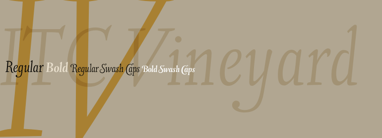
尽管ITC Vineyard的灵感来自18世纪英国名片上的雕字,但它具有其独特的特征。该字体保留了铜版字体的某些特征,但是粗线和细线之间的区别不是很明显。有几种草书形式,但大多数字母都是罗马字母:它们几乎是直立的,且没有连接在一起。偶尔的花式会通过各种来源(如名片上的刻字和书法大师的抄本)被随意解读。设计师Akira Kobayshi说:“我认为这是一种新型的'copperplate脚本',它不太正式,也不容易阅读。大写字母和数字有明显不规则的倾斜角度,但字体的古怪使字体页更加友好而不是冰冷的光辉。ITC Vineyard采用两种字重设计:常规和粗体。每个变体都包含几个额外的字符,例如带有长长字臂的替代小写字母‘d’、T-h连字、以及一对花体。两种字重均具有花式大写字母。花式大写字母还包括老式数字。Kobayashi指出:“有些花式大写小写字母组合会相冲突或显得笨拙。在这种情况下,我建议使用普通大写字母。也不应设置为全部花式大写字母。”
Although inspired by the engraved lettering on eighteenth-century English trade-cards, ITC Vineyard has unusual characteristics of its own. The type retains some quality of copperplate scripts, but the differentiation between thicks and hairlines is not very sharp. There are a few cursive forms, but most of the letters are romanized: they are almost upright and not joining. Occasional flourishes are casually interpreted from various sources such as the lettering on trade-cards and writing masters' copybooks. “I think it is a new kind of 'copperplate script' which is not too formal and easier to read,” claims designer Akira Kobayshi. Irregularities are apparent in the angle of caps and numerals, but the face's quirkiness gives a type page some friendliness rather than cold brilliancy. ITC Vineyard is designed in two weights: regular and bold. Each variation includes several extra characters such as an alternative lowercase 'd' with a long arm, a T-h ligature, swelled rules, and a pair of flourishes. Swash caps are available for both weights. The swash caps variation also includes oldstyle figures. Kobayashi notes: “There are a few swash-cap lowercase combinations that collide or look awkward. In that case, I recommend using the plain caps. Setting all swash cap copy should also be discouraged.”
Although inspired by the engraved lettering on eighteenth-century English trade-cards, ITC Vineyard has unusual characteristics of its own. The type retains some quality of copperplate scripts, but the differentiation between thicks and hairlines is not very sharp. There are a few cursive forms, but most of the letters are romanized: they are almost upright and not joining. Occasional flourishes are casually interpreted from various sources such as the lettering on trade-cards and writing masters' copybooks. “I think it is a new kind of 'copperplate script' which is not too formal and easier to read,” claims designer Akira Kobayshi. Irregularities are apparent in the angle of caps and numerals, but the face's quirkiness gives a type page some friendliness rather than cold brilliancy. ITC Vineyard is designed in two weights: regular and bold. Each variation includes several extra characters such as an alternative lowercase 'd' with a long arm, a T-h ligature, swelled rules, and a pair of flourishes. Swash caps are available for both weights. The swash caps variation also includes oldstyle figures. Kobayashi notes: “There are a few swash-cap lowercase combinations that collide or look awkward. In that case, I recommend using the plain caps. Setting all swash cap copy should also be discouraged.”


 京公网安备 11010802030123号


 商业发布授权
 出版物授权:针对出版物
 嵌入式应用授权