


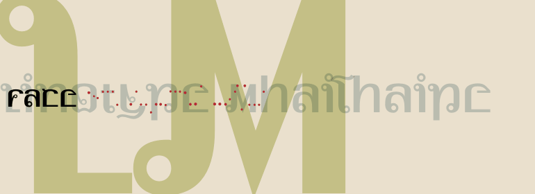
Linotype MhaiThaipe™

品 牌:

设 计 师:
Remscheid,Markus
分 类:
衬线体
字体属性:
外文
字体编码:
Unicode
标 签:
字体介绍:
Linotype Mhai Thaipe包含在TakeType字体库中,它是从1994年和1997年Linotype举办的的International Digital Type Design Contests的参赛作品中选出的。
德国设计师Markus Remscheid的作品,从名字就能读出该字体的总体特征。点缀在字母上的小圆圈以及看起来像阿拉伯语和梵语混合的不寻常的流动字形相结合,使该字体看起来颇具装饰性和异国情调。Linotype Mhai Thaipe最适合用于大小为12pt或更大的标题。
Linotype Mhai Thaipe is part of the TakeType Library, chosen from the entries of the Linotype-sponsored International Digital Type Design Contests of 1994 and 1997. The work of German designer Markus Remscheid, the name is not hard to recognize as an English-Asian play on my type" and describes its general character. The small circles which ornament the alphabet and the unusual flowing forms which look like a mixture of Arabic and Sanskrit combine to give the typeface an ornamental, exotic look. Linotype Mhai Thaipe is best used for headlines with point sizes of 12 or larger."


 京公网安备 11010802030123号


 商业发布授权
 出版物授权:针对出版物
 嵌入式应用授权