


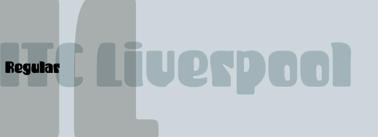
ITC Liverpool™

品 牌:

设 计 师:
Bailey,Kevin
分 类:
衬线体
字体属性:
外文
字体编码:
Unicode
标 签:
字体介绍:
肥厚、粗壮且圆滚滚;那就是由Kevin Bailey设计的ITC Liverpool。字母形式柔和且有点古怪,其特征是字怀很小,它们在字母之间移动,就像卡通眼球上的高光一样。Liverpool的一些字母让人联想到20世纪30年代的显示字体,然而这个充满想象力的字体在60年代也同样适合。不适合印刷上的胆小。不适合小心翼翼的排版。
Fat, bold, and comfortably bulbous; that's ITC Liverpool, designed by Kevin Bailey. The letterforms are soft and mildly eccentric, characterized by tiny counters that shift around from letter to letter like the highlights on cartoon eyeballs. Some of Liverpool's letters are reminiscent of display lettering from the '30s, yet this exuberant face would also be right at home in the '60s. Not for the typographically timid.
Fat, bold, and comfortably bulbous; that's ITC Liverpool, designed by Kevin Bailey. The letterforms are soft and mildly eccentric, characterized by tiny counters that shift around from letter to letter like the highlights on cartoon eyeballs. Some of Liverpool's letters are reminiscent of display lettering from the '30s, yet this exuberant face would also be right at home in the '60s. Not for the typographically timid.

 京公网安备 11010802030123号


 商业发布授权
 出版物授权:针对出版物
 嵌入式应用授权