


品 牌:

设 计 师:
Cumming,John F.
分 类:
衬线体
字体属性:
外文
字体编码:
Unicode
标 签:
字体介绍:
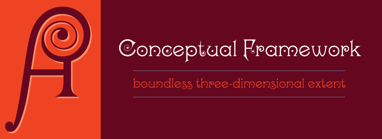
Kismet具有现代装饰性字母的外观,但事实上却不是这样:该字体是由John F. Cumming于1879年设计的。其基本字形是经过严格构建的,大部分形式都是基于圆形,而这一形状还会一次又一次的出现。Cumming用螺旋元素和字母中间的小圆圈装饰了他的图形。花式图案和某些个性特征,如T,M或P,暗示着青年风格(Jugendstil)的诞生。小的尖头衬线为所有花朵状的东方装饰增添了醒目的元素。虽然这在新闻标题中使用的不多,但奢华的Kismet一定会引起人们的注意。
Kismet has the look of a modern, ornamental alphabet, but looks are deceiving: the typeface was designed by John F. Cumming in 1879. The basic forms are strictly constructed, most based on the form of a circle, a shape which also appears again and again in the ornamentation. Cumming decorated his figures generously with spiral elements and tiny circles in the middle of the letters. Characteristics which suggest the beginning of the Jugendstil are the floral designs and some individual forms, for example, T, M or P. Small, pointed serifs add a sobering element to all the flowery, oriental decoration. Used sparingly in headlines, the extravagant Kismet will be sure to attract attention.
Kismet has the look of a modern, ornamental alphabet, but looks are deceiving: the typeface was designed by John F. Cumming in 1879. The basic forms are strictly constructed, most based on the form of a circle, a shape which also appears again and again in the ornamentation. Cumming decorated his figures generously with spiral elements and tiny circles in the middle of the letters. Characteristics which suggest the beginning of the Jugendstil are the floral designs and some individual forms, for example, T, M or P. Small, pointed serifs add a sobering element to all the flowery, oriental decoration. Used sparingly in headlines, the extravagant Kismet will be sure to attract attention.


 京公网安备 11010802030123号


 商业发布授权
 出版物授权:针对出版物
 嵌入式应用授权