


品 牌:

设 计 师:
Grimshaw,Phill
分 类:
衬线体
字体属性:
外文
字体编码:
Unicode
标 签:
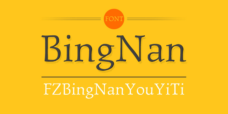
字体介绍:
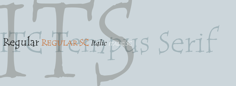
ITC Tempus是英国设计师Phill Grimshaw的作品。他声称每个书法家的志向都是想用钢笔画出完美的罗马大写字母,但是他承认这非常困难。对于这款字体,Grimshaw使用钢笔在便宜的多孔纸上书写,当然墨水会渗。最终的形式很经典,但其粗糙的边缘与罗马式的完美外观有所不同。Grimshaw表示:“ Tempus Sans只是被准确去除衬线的Tempus,但字符的比例仍然很好。”由于质感粗糙,该字体在较大的磅值时效果最好,但是即使在较小的尺寸下也能保持其个性。
ITC Tempus is the work of British designer Phill Grimshaw. He claims that every calligrapher's aspiration is to draw perfect roman capitals with a pen, but admits that this is extremely difficult. For this typeface, Grimshaw used a fountain pen on cheap, porous paper and, of course, the ink bled. The resulting forms are classic but their rugged edges deviate from the perfection of roman type. And Tempus Sans is just Tempus with the serif surgically removed, yet the proportions of the characters work nicely," says Grimshaw. Because of its rough quality, the typeface works best in larger point sizes, yet maintains its characters even in smaller sizes.
ITC Tempus is the work of British designer Phill Grimshaw. He claims that every calligrapher's aspiration is to draw perfect roman capitals with a pen, but admits that this is extremely difficult. For this typeface, Grimshaw used a fountain pen on cheap, porous paper and, of course, the ink bled. The resulting forms are classic but their rugged edges deviate from the perfection of roman type. And Tempus Sans is just Tempus with the serif surgically removed, yet the proportions of the characters work nicely," says Grimshaw. Because of its rough quality, the typeface works best in larger point sizes, yet maintains its characters even in smaller sizes.


 京公网安备 11010802030123号


 商业发布授权
 出版物授权:针对出版物
 嵌入式应用授权