


Monotype Bodoni™

品 牌:

设 计 师:
Monotype Design Studio
分 类:
衬线体
字体属性:
外文
字体编码:
Unicode
标 签:
字体介绍:
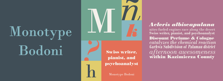
Bodoni意味着工业革命的开始;它的衬线是平滑的直衬线,而应力始终是在垂直笔画上。Bodoni主张有足够的留白,所以它的下伸部很长。M相当窄;在Q的尾巴先是垂直下降的,而R的尾巴则是卷曲的。像大多数欧洲大陆的现代字体一样,斜体也有罗马衬线。
Monotype Bodoni由于其简单性而显得轮廓非常清晰。它的翻印效果很好,尤其是尺寸超过12pt时。该字体比Bauer Bodoni稍黑。这样的对比使Monotype Bodoni显得更加细窄。
Bodoni expresses the beginning of the Industrial Revolution; its serifs are flat, think and unbracketed, while the stress is always on the mathematically vertical strokes. Bodoni believed in plenty of white space and therefore descenders are long. The M is rather narrow; in the Q the tail at first descends vertically and the R has a curled tail. The italic, like most continental modern faces, has roman serifs.
Monotype Bodoni provides a clear-cut effect due to its simplicity. It reproduces well, particularly in sizes over 12pt. This font is slightly darker than Bauer Bodoni. The contrast makes Monotype Bodoni appear more condensed.


 京公网安备 11010802030123号


 商业发布授权
 出版物授权:针对出版物
 嵌入式应用授权