


Esperanto™

品 牌:

设 计 师:
Luin,Franko
分 类:
衬线体
字体属性:
外文
字体编码:
Unicode
标 签:
字体介绍:
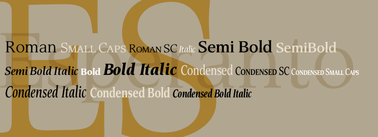
Esperanto的设计师Franko Luin对该字体的看法是:Esperanto与经典字体有很多相似之处,且对经典字体也有很多更新的诠释。其斜体使人联想起文艺复兴时期的刻字思想及他们的手稿。这种字体的名称当然是指国际语言Esperanto。该字体与世界语的字符集并不兼容。
Franko Luin, Esperanto's designer, on this typeface: Esperanto has a lot in common with classic typefaces, and newer interpretations of the classics. The italic reminds of the lettering idea of the Renaissance and their manuscripts. This typeface's name refers to the international language Esperanto, of course. The font is not compatible with the character set of the Esperanto language
Franko Luin, Esperanto's designer, on this typeface: Esperanto has a lot in common with classic typefaces, and newer interpretations of the classics. The italic reminds of the lettering idea of the Renaissance and their manuscripts. This typeface's name refers to the international language Esperanto, of course. The font is not compatible with the character set of the Esperanto language


 京公网安备 11010802030123号


 商业发布授权
 出版物授权:针对出版物
 嵌入式应用授权