


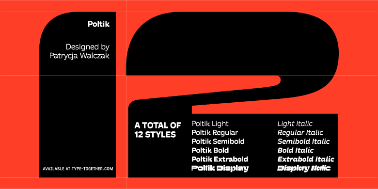
Poltik family

设 计 师:
PATRYCJA,WALCZAK
分 类:
无衬线体
字体属性:
外文
字体编码:
Unicode
标 签:
字体介绍:
Patrycja Walczak’s Poltik font family wants to start the festivities. As the 2023 Gerard Unger Scholarship winner, its overall presence refuses to tuck away discreetly, but struts in with head high and arms outstretched, joyfully determined to welcome everyone to the party.
Poltik was inspired by a 1970s clock design Patrycja found in her grandfather’s drawer. From only those ten numerals, she created the bold, funky display cut of the family, and then designed complementary styles appropriate for text. Combining ideas of brutalism and individuality, Poltik display is an expressive and experimental beast of a headliner with a regular and italic style. Large formats like posters and website headers are its natural environment, and it grabs the limelight by having just enough quirks to hold attention.
Its ten text styles (five upright with matching italics) are a reversed contrast sans serif for many uses, and as such, all Poltik’s sediment has settled in the northern and southern hemispheres of each glyph. It exhibits its style as a readable and reliable sans that is wholesome and smiling, and shows more of its innate character the bolder it gets. Two variable fonts allow for almost infinite styles for complete control in a smaller data package.
Poltik has systematised cheekiness and funk to be as strong in functional ability as it is in aesthetics. For instance, the counters within the ‘e, a’ interact with each other and the ‘K, R’ retain their swooped leg throughout the family, allowing them to sway next to their other cheerful partners. Poltik’s mesmerising nature is ideal for concept store signage, a coffee shop, restaurant, or retro furniture store. It has as much potential for packaging, book covers, and magazines as it does for album covers, posters, and branding. And it harnesses all these powers in the digital world as much as in the physical one.
Poltik acts like a statement piece of furniture by adding something both intimate and immense to our recollection of 1960s and ’70s style. It takes inspiration from the well-established ethos of the past and expresses it as an interpretation clothed in a funky and consistent new form, welcoming all types to the party.


 京公网安备 11010802030123号


 商业发布授权
 出版物授权:针对出版物
 嵌入式应用授权